
A logo hat collection needs recognisable identity across shapes that do not offer the same decoration space. A mark that works on a tall front may overpower a soft dad hat or become unclear at a smaller side position. Start with the essential brand features, then approve each physical interpretation.
The custom dad hat buying guide provides a related construction reference. Use this checklist to prepare the relevant branding or embroidery decision.
Identify what must remain recognisable
Name the essential symbol, wordmark proportions, spacing and colour relationships. Separate those features from details the brand may adapt for a particular style. Keep the authorised master intact while any production adaptation receives its own revision.
Build a collection sheet showing the proposed headwear shapes and logo positions at useful scale. Avoid enlarging every mark to fill the available space automatically. The complete wearing view should help decide whether each interpretation belongs to the same range.
Review the effect against the chosen construction
Use the logo decoration route checklist to compare the relevant methods. A patch, print and direct embroidery interpret the same artwork differently. Ask for physical examples when an important detail or surface effect is unresolved.
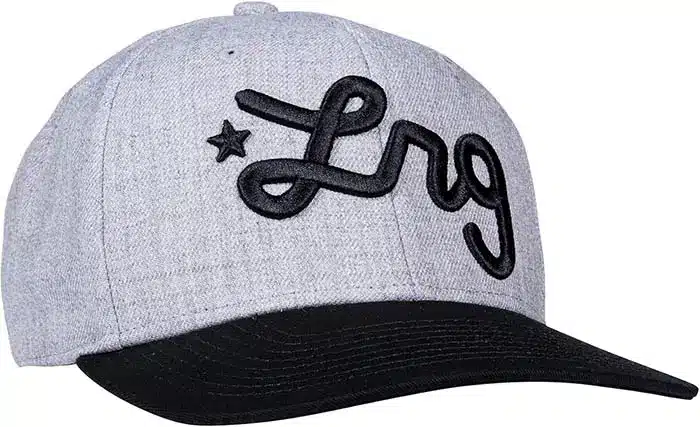
Madeira’s foam embroidery guide illustrates a technique prepared specifically for foam-supported dimension. It should not be treated as a universal interpretation of the brand mark. A simpler flat version may remain a separate approved option for another position or construction.
Build a sample grid that names each adaptation
Record style, cap colour, logo version, dimensions, placement and decoration route. Review the relevant complete samples together. Look at readable detail, apparent scale, crown shape and the relationship between exterior and inside branding.
If one style uses a simplified symbol while another uses the full wordmark, name that distinction in the range sheet. Keep approvals tied to the actual combination. A shared design direction does not mean a single sample releases every interpretation.
| Check | Reference to retain |
|---|---|
| Identity | Essential mark features and permitted adaptations |
| Style | Headwear construction, colour and decoration position |
| Artwork version | Actual-size design, dimensions and selected method |
| Sample grid | Accepted complete combinations and unresolved variants |
| Repeat | Relevant prior style and changes requiring review |
Use the collection record for launches and repeats
The drop release plan helps connect accepted combinations with photography and channel allocation. Ensure the product shown for launch corresponds to the released construction and artwork version.
For a new season or repeat, compare the proposed cap and decoration with the relevant accepted style. Identify changed fabrics, shades, dimensions or techniques before extending the earlier approval. This retains the brand’s recognisable features while keeping each product decision traceable.
Discuss the proposed construction through the related cap product page. Send the artwork, cap reference, quantities and open questions through Contact Wenext Caps so the next proposal or sample addresses the actual brief.